Pages

Tuesday, September 20, 2011

Ode to a Light Fixture

Long ago, when Niels and I were talking about our dream house and furnishings, he reminded me that in our storage room we had the dining room fixture from his house in Belgium. It had been thoroughly wrapped and secured by the moving company that packed up all his household goods and shipped them to the States, and he's been waiting to put it back up. By the time we replaced the brass fixture in our current dining room, we already knew we were moving, so he didn't want to install it here. So, it's still in the box. And I have yet to see it. But, I'm a practical girl, so I agreed that if Niels loved it, that whatever it looked like would be fine in our new house, because free is the greatest price of all--after we pay to rewire it for US lighting code, of course. 

Until I started seeing this lovely Capiz Shell Chandelier from West Elm everywhere.

I can't even remember the first time I saw it, only that I thought it was the most beautiful thing ever. I had no idea where to find it, or (gulp!) how much it might cost. So I forgot about it...until I saw it again on an episode of "Bang for Your Buck" and said something like, "STOP! Niels! Look! THAT'S the chandelier I was telling you about! Isn't it PRETTY?!" To which he mumbled that, "yes, it was nice, but we have a perfectly good fixture that we already own." Okay, can't argue that logic.


Then, I saw it again on HGTV's "Design Star" where they finally said where they bought it (West Elm) and for how much ($299). I was thinking it was going to be MUCH more than that, and even though it's still a lot for a light, it's not nearly the splurge I was afraid it would be. It started to grow on Niels then, too. 

A few weeks ago, we were in Columbus to price out my backsplash tile. We stopped by Eaton Mall to pick up somethings at The Container Store, and as we were walking around, I saw the sign for West Elm. I had no idea there was a brick and mortar store in Columbus! We walked in, and saw the real live chandelier. They had the black one on display:
And then Niels was sold. :-) And suggested that we put his fixture in the office, since that will be "his" room. 

A few days ago, we got the call that my tile was in, so we called West Elm to make sure they had a chandy for us--Cbus is 2 hours away. They did! So, we spent a happy day getting our goodies and crossing our fingers that our new potty trained toddler would stay day (he did!).

Because I love this fixture so much, and since we don't even have drywall on our walls yet (hopefully this week!), I scanned the web to see if anyone else loves it as much as I do. Turns out, this gal does. Alison at House of Hepworths wrote not one, but two blog posts about this West Elm chandelier. She had a lot more trouble getting hers than we did--we just picked it up at the sales counter--and I'm printing out her second post for our builder so they can learn from her challenges. Apparently, it's a might be time-consuming to put up.

But, it's up and she loves it. AND she has dark gray walls with lots of light, so I got a really good idea of what it'll look like in our house. Take a look. (Note: We're not sure how to take away the pin button on the photos below. If you like what you see--and why wouldn't you?--please go here and pin from the source. Thanks!)


Friday, September 16, 2011

Siding and Soffit

I've been a bit under the weather this week and not getting to the house every day. We did manage to drive by on Friday and I was quite pleasantly surprised to see that the crew was almost done with the siding!
The view as I pulled in.
The view from the back.
The shot of the house that is almost all siding. (There will be a little strip of stone along the bottom).
When we came back later, we saw that they had most of the shakes up, too. The garage and bottom half of the front porch will be stone.
The back porch with stamped concrete, soffit and siding. Almost ready for the grill!

Color Selection

This is a bit of slow season in our build as the electrical/plumbing/HVAC finishes up. There's been a little bit of insulation blown in and then we're see the drywall going up. At the point, our house will really start to look like a home.

We've handed off our flooring selections, and the folks from Charis will do a little research so see if we can get the costs in line with our allowance. 

The other big batch of decisions we made this week was selecting the colors for our soon-to-be walls. Sue, from Charis, came over with her big book of Sherwin Williams color swatches and we got to work. Our allowance is for six colors, though we could always pay more for additional colors if we wanted them. Our current house has five colors (mostly one outside the bedrooms), so we figured six was plenty.

In our current house, our base color is what I call "chocolate milkshake." When we put in on almost 5 years ago, it really reminded me of a Wendy's Frosty. But as we've been looking at models and watching HGTV, we've been won over by gray as the new neutral. It works with our modern bent and our steel appliances and fixtures, so we think it will look nice. 

Thanks to the Sherwin Williams Color Visualizer, we're able to get a large scale sense of how the colors will look.

We'll use the darker gray as the base on the first floor for the kitchen, great room, dinette (maybe, see below), foyer, mudroom, office and maybe in-law bath (if we don't go with the room color). We'll  use the lighter gray upstairs in the guest bedroom, hallway and our bath, with a transitional treatment using both hues on the stairway. 
SW Classic French Gray
SW Light French Gray
The next decision was the in-law suite. We knew that it would be the same (or Sherwin Williams equivalent) or our current master bedroom colors, which is sage green and chocolate. I was happy to keep those colors (since we have all the accent decor) for our new master until my awesome hubby said we could use plum: my most favorite color! So here's the color for the in-law suite (and laundry room)
SW Dried Thyme
So, our room will be this pretty plum color! Our wedding colors were platinum and plum, so of course, I love that subtle reminder in our bedroom. What can I say, my husband is the greatest!
SW Expressive Plum
Just for giggles, I did this rendering for the dining room. It looks a lot richer/deeper than the rendering of our bedroom. Interesting. Our dinette will be very bright because it has windows on all three sides (and open on the fourth), so I think we could play with a darker color if we wanted to be crazy with it.
SW Expressive Plum
Our 2.5-year-old son's favorite color, for quite some time has been yellow. When we asked him what color he wanted his new room to be, he has quite consistently requested yellow. However, yellow is not really the calm nap/deep sleeping-inducing color we have in mind, so we're sticking with blue like he has in his nursery, but more of a "big boy blue. We saw this particular color in another Charis home and we feel in love with it.
SW Bracing Blue
So that leaves one last color. We had to decide between the vibrant orange Dutch bathroom I put off in our current house because we needed to be neutral or yellow for our amber-obsessed son. After looking at pictures of my Dutch decor, we decided that the yellow would work, so this is the yellow for our powder room and D's bath. The power room will have orange tulips for accents, and D's room will have blue accents.
SW Bee's Wax.
We made all these selections in our home, at night, under warm lights. Sue, our interior designer, is ordering larger samples that we'll bring to the new house to view with natural light. If needed we can adjust the tones.

I can't wait to see it all come together!

Thursday, September 8, 2011

Stamped Concrete


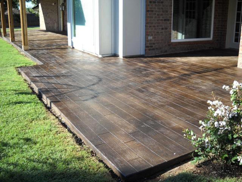
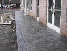
When Niels and I were looking at model homes, we often stopped to admire what we thought was a pretty stone walkway or patio. It wasn't til much later that we discovered the beauty of stamped concrete. Stamped concrete is a way of using forms to mimic any look you'd like: stone, wood, tile, brick...you name it. It has all the look of pricier materials with not of the white-glove maintenance...or price. 

Here's a few samples of stamped concrete.

Can you believe this is concrete, and not wood?
Source: The Little House That Could
This is stamped concrete, too. Not brick: 
Source
Stamped concrete, not pavers. 
Paver Stones Patio
Source

So, when it came time to decide what we were going to do about our back porch, we had scaled back from wood or composite or stone, and were looking at something like this:

stamped ashlar slate


Just for giggles, I took a field trip to the local concrete yard to check out what we could do. Fortunately, I really liked this one, which is the least expensive option because the base color is plain concrete and only the top has charcoal added. I learned that this makes a big difference because when you add color to the main (integral) color, the crew has to clean out the truck a bit more thoroughly...which of course, you pay for.

Ashlar Slate design with plain concrete and deep charcoal release.
So today was the big day. My toddler son and I were able to watch part of the work this morning, but unfortunately, naptime got in the way of seeing the actual stamping process.

The crew prepped by placing rebar and replacing the original supports with new ones that  were off the porch.
This little Bobcat made about 30 trips back and forth with the concrete.
Pouring the first load.

Spreading the concrete.
All done. We left for naptime while the concrete set a bit.
Before we left, the foreman showed me the forms they used and how they fit together.
There are several slightly different forms so that the overall effect is orderly, but with variance.
Our fabulous new back porch!

Friday, September 2, 2011

Build - Day 50 - September 2, 2011

Yesterday we had a great turn-out for our Dusty Shoe Open House. Between 5:45pm and 8pm we had a steady stream of guests. We handed out little cards with our builders info as well as the URL to this building blog so anyone who wants to can continue following the progress and read-up on our decision-making processes. Thanks to those who took the time to visit our dream house!

Today they are pouring the concrete floors. We have a number of them: the front porch, back porch, garage and basement floor. Keeping with our Universal Design principles, the front porch will be made accessible for a wheelchair. Our original idea was to use the back porch into the inlaw suite as an accessible entry, but then we thought of our lovely North-East Ohio winters...

The covered front porch is much easier to clear than a whole exposed walk-way to the back. Don't really want to tell our wheelchair guests to sit out in the car for 15-20 minutes while we shovel/plow that entire walk-way. Also, if something happens to one of us--especially if Jen hits her head again and has mobility issues--redoing the walk is one less thing we have to think of during that stressful time. Some people might think it looks a bit odd, but anyone having difficulty with steps (e.g. bad knees, arthritis, hip-issues and of couse, wheelchair-bound) will find this quite welcome and sometimes even required.

Today they just did the basement, front porch and the garage. The steps/ramp/driveway will come later in the build when no more heavy trucks need to pull up anymore... ;-) The back porch will be stamped concrete. Jen picked out the pattern and color yesterday. That will be done at a later date since we need to keep at least one entrance to the house available while the rest of the cement dries.

Big cement truck, we had 3 today.
The concrete starts to flow
Basement poured.
The fans help with the drying and moisture levels
On to the garage...
Smoothing out the garage floor
Garage floor finished
We had to wake him up on his 1st potty training day, but it was worth it. We've dedicated the house. Welcome to the 'Daniel'!

Thursday, September 1, 2011

Punch List Page

Like most naive first time home builders, Niels and I discussed everything detail we could think of before signing off on the "final" blueprint of our house. We really thought we couldn't have possibly missed anything. Lots of people said that you always want to reserve a buffer for unexpected costs that come up along the way. But Niels and I are bit more tedious than the next couple when it comes to planning, so we didn't think that would apply to us as much.

Wrong.

There's just some things you can't anticipate as you're looking at a one-dimensional floor plan. Some times things that look great on paper are not very pragmatic in real life. Often times, for me anyway, we don't have any idea of what a particular item costs until we're in the middle of installing it. Whenever people would talk about overages and upgrades, I never really knew where those numbers were coming from. I thought it would be helpful for me, and hopefully for anyone who reads this blog, to get a specific sense of what kinds of things come up during the process of building.

Disclaimer: typically, the term "punch list" refers to last minute items that need to/should be competed before occupancy. I'm taking creative license to use it for all the things that need to be tweaked, changed, added, subtracted, touched up, taken out, etc. throughout this process.

We've added a new Punch List tab so you can find our ongoing list.