Pages

Wednesday, August 31, 2011

Dusty Shoe Open House


When we first started dreaming about building, we spend many hours touring houses: the Parade of Homes, open houses and model homes. If it was anywhere near us, we were there. As we started to picture what kind of home we'd like to build, we started looking behind all the typical bells and whistles, upgrades and fancy finishes. We starting thinking about what elements would really make our house a dream.

The American housing market is overrun with McMansions that aren't selling because home owners are now looking for quality over quantity, and efficiency over extravagance. Even if a buyer finds a big house bargain, can they afford the taxes and utilities of such a home???

Don't get us wrong, Niels and I both appreciate the nice things in life just as much as the next person, but for us, the question always comes down to practicality. Are we going to spend more on cork floors? Yes, because they are sound insulating, which decreases the frequency and/or severity of my headaches, which gives me a greater quality of life. Easy. Are we going to spend more for a high-end custom tile shower? Nope, because we can get just as clean in a fiberglass insert shower and don't have to worry about cleaning all that grout!

When it came time to choose a builder, the structure of our new home was as important as the finished product. Anything can look high-end for a few months waiting for a sale. We wanted to know that the home we built would be a solid home for years to come. We actually walked into one model, maybe 6 months old, and there was already a HUGE crack along the ceiling. Didn't take long to cross them off our list. Realizing each house 'settles' we thought, if this is how they treat their models, what does the house without all the scrutiny look like?

One of many reasons we chose Charis Homes is that they have "dusty shoe" open houses. It's an opportunity to see the bones of a building before all the sheet rocking goes up and it looks like any other house. It was at a Charis dusty shoe that I saw my first ICF form and finally understood why Niels was so adamant that we needed to use it for our home.

We've been to maybe ten dusty shoes with Charis and we continue to be impressed with the quality of construction. We think it says a lot of a builder if they invite potential home owners to visit their work "behind the scenes." Of course, we also appreciate that we are welcome, as the home owner now, on the job site at any time. Our builder assures us that he rather hears about our concerns or mid-course changes sooner rather than later (since no matter how final you think your plans are, they really aren't. Some things can really only be seen in real life).

So tomorrow, we get to pay it forward to any local potential home owners. We're have a dusty shoe open house for our new house, tomorrow, September 1. (If you're local, and want to check it out, send us an email and we'll give you the address).

I put on my old marketing pants and we came up with this description:

Nestled in the back of the quiet and kid friendly KR development in G..., this four bedroom, 3.5 bath home has ample adjacent green space and stunning sky views. The design of this house was a result of diligent home-owner research combined with Charis Homes’ expertise in energy efficiency.

The two story, full ICF home has upper and lower master bedrooms, two additional bedrooms, a large dual-island kitchen designed for baking, entertaining and easy green living. The entire first floor was built with universal design principles including wide hallways, easy-to-use pulls and rockers, lowered baking center and kitchen drawers to make this house a forever home. Thoughtful consideration was given to practical living and ample storage with features like mudroom lockers, first (and second) floor laundry, and a generous 9’ x9’10” walk-in pantry. The beautiful 13′x28′ covered outdoor living space features fans and wheelchair access.

In a future post, we'll make a full laundry list of all the energy efficient and universal design elements we've incorporated, but here are a few to get started:
  • HERS (Home Energy Rating) Score (est.): 42, or 58% more efficient than standard home construction. Projected annual gas bill: $300.
  • High efficiency heat pump
  • High efficiency furnace
  • Extremely tight thermal envelope
  • Low-e 366 Jeld-wen Energy Star windows
  • ICF basement, unfinished
  • ICF walls on the 1st and 2nd floor
  • Shingles with reflective technology
  • All Energy Star appliances
  • Cork and recycled carpet fiber floors
  • No VOC paint and cabinets
  • Heat Recovery Ventilator for fresh air
  • WaterSense low-flow faucets
  • WaterSense low-flow and/or dual-flush toilets
  • Compact yard for low maintenance

Monday, August 29, 2011

Build - Day 47 - August 29, 2011

First of all, happy 49th monthaversary to my lovely wife... Love you!. So, that marital duty performed; on with the show...

Today is one of those very 'sexy' building days when they are running wires, cables and PVC pipe. Not a lot of photographic progress and when they are done it almost looks more messy than when they started. Yet, it's all part of the process to make our dream house actually function the way we designed it.

The one item that did show progress was the arrival and installation of the jetted tub in our master bath. We know, a jetted tub is not the 'greenest' product on the planet but we will not use too often so we'll let that one slide.

Over the last few days they also prepped the porches and the garage for the concrete later in the week. The plan is to put those in on Thursday. We also found out last Friday that our nice sliders, which we intended for wheelchair access, aren't even close to 36". Uh oh.

Since we are trying to incorporate as much universal design on the first floor as we can afford, being able to have a wheelchair accessible entrance is pretty important. Our parents are baby boomers, plus if one of us gets in an accident and ends up in a wheelchair at least we know we don't have to demo our house just to get in. The plan was to use the back-deck into the in-law suite as that accessible entry but as we discovered that the sliders closed the door on that idea, so we're adjusting our front entrance from a single step to a slight slope. More like this:

One setback we discovered today has to do with the top part of our in-law suite shower. The first time, it arrived damaged. This one was fortunately dent and scatch free. Slight issue: it's not the same color as the rest of the shower... oops! ;-) Ah well, we have some time before we move in so plenty of time to get that fixed. Sure glad we didn't use that supplier for our kitchen cabinets though...

And here are those 'sexy' pictures...
The manoblock; each faucet in the house has its own connection. Guess you can guess the meaning of the colors...

The wires are just hanging out...
One of the must-have items; Central Vac.
Master Bath 'command central'
Our tub is in. Opted for the 5ft so we can have wider surronds. Safer for the vertigo-challenged among us.
A 'sexy' picture to end it for tonight...

Kitchen decision... made

Remember that little post saying we were going to announce the winner of our 'kitchen cabinet contest' the next day. Well, we kind of forgot to put that post up... And the winner is...:
Yoder Cabinets out of Fredricksburg, OH.

Yep, we went local and we went Amish. In the end it came down to two suppliers. The shop that already was awared the countertop job and our Amish supplier. The countertop supplier was literally $3 lower than our Amish supplier on the kitchen pricing. Not 3%, no, $3... okay, and 32 cents.

The supplier out of Medina was more than 100% over the median price so that was elimination 1, the supplier out of Akron pretty much doubled their quote over the initial estimate so they got booted after that, the supplier out of Copley was in the ballpark price-wise and had a good quality product but we simply didn't connect so they came in 3rd.

In the end, the final decision was fairly easy; for the same price as a semi-stock cabinet ordered out of North Carolina we could get a local, full custom, Amish-made kitchen. Both suppliers had a great product and were the only two that understand what we wanted, took the time to listen to us and connected on a level we needed to feeel comfortable with for the items which will be the focal point and most used in the whole house.

Our Amish supplier recently started his own company after learning the trade for 15+ years at a fellow Amish cabinet maker. He doesn't yet have a showroom so he invited us into his home. It's a rare and very much appreciated gesture to get invited into an Amish house with the family at home going about their business. From the outside it appears completely modern and at first glance, the inside also looks just like an 'English' house. Until you see that the lights are gas-powered and a solar panel is powering the few electrical tools they can have.

His family was so welcoming to us and he connected with us on a personal level it made us decide he would get the job even if he would be a bit more expensive. When his price came in dead even with our 2nd place finisher it took all but 1 second to make the final decision.

In return for his business and hospitality we are also very happy to offer him a showroom for about 6 months when our dreamhouse will be used as the model home by our builder. This way both parties come out ahead and -- rant alert: unfortunately we don't see too much of that shared effort in our country lately -- end of rant alert.

Wednesday, August 24, 2011

Build - Day 42 - August 24, 2011

We're baaaacccckkk! ;-) Not a lot of visual progress this week. The crews have been busy on the inside of the house and the plumbing and HVAC lines are mostly done. The biggest visual impacts are in the basement, bathrooms and attic space.

The other things happening are outside of the new house and relate to flooring choices. We've settled on our tile (Emser Strands for floor tile, Solistone Carrellton for the kitchen backsplash) and know we will be doing cork in our kitchen and dinette. We're not sure yet on the type of carpet but are leaning towards either EverStrand (Mohawk) / Green Smart (Bliss) fibers which are both made out of recycled PET bottles or the SmartStrand (Mohawk) that is made from corn in a methane-powered factory which a near unbeatable stain resistance.

The other item that rocked our world this week was the 5.9 earthquake in Virginia. That is about 8 hours from here but was strong enough to give you some weary sea legs similar to your first voyage at sea. I wish we would be in our new house which is basically earthquake proof with 6.25" of concrete for all exterior walls from the basement to the attic. To be honest, the 5.9 quake was the largest in 150 years but it is still nice to know that mother nature would need to bring her A-game.

Also, when looking at our toilets our GC realized that in one of the bathrooms our toilet was directly over a floor support. This would have mend a switch to a single-flush so we're switching the vanity and toilet location so we can keep our dual-flush toilets.

On the back patio we've added two gas lines; one for the grill and one for some overhead terrace heaters you'd normally see at restaurant patios. This will extend the usability time of our back patio far into the fall and winter. We're looking forward to a nice grilling session outside watching the snow fall outside from our heated patio.

Alright, off to load some pictures so y'all can see the progress too... and here they are:

Electrical boxes for switches and outlets. We're using the rocker style switches instead  of the regular switches.
Plumbing for the main-level laundry.
The product box...
The product used (with insulation surrounding it)
2nd story laundry room plumbing
Basement plumbing (left side is the rough-in for a future planned bathroom)
Return-air roster
The flooring choices: espresso shaker cabinets, white quartz counters, kitchen back splash, Emser floor tile, cork sample and carpet sample all in our colors. We think it looks pretty good... ;-)


Wednesday, August 17, 2011

Build - Day 37 - August 17, 2011

Today was the day we had almost all of our subs coming through the house measuring, marking and installing.
Kitchen - Cleanup island marking
  • First up was the electrician for lights, switches, outlets and network cabling. 
  • Second was our cabinet maker measuring and marking for all the cabinets in the whole house, including the kitchen. 
  • Third up was the plumber who not only measured but also started installing some of the plumbing. 
  • Last but not least our door supplier came by to mark for the doors, including such a simple question as which way a door should swing.
Marking for the switches
The walk-through also revealed a few - minor - things that needed to be adjusted for all aspects of the house to work correctly. Here is the change log for today:
  • Kitchen: Clean-up island will be 48" away from the prep island to allow the dishwasher to open as well as have the ability for the opposing drawers to fully extend at the same time.
  • Kitchen: Added additional can lights for more light.
  • Main floor laudry: added 10" of depth to allow the washer and dryer to fit while creating room for shelving / peg-board on the inside of the laundry doors.
  • In-law closet: reduced size to accommodate the laundry expansion, moving the door to keep room for shelving.
  • In-law bath: re-frame the shower area down from 78" (for a custom tile shower) to a 60" for a fiberglass inset. Creating shelving in the now freed-up 15" (18" minus framing). 
  • 2nd floor laundry: swap the layout from the 4th bedroom wall to the outside wall to reduce noise.
  • Master bath: decided to go with a 6ft tub versus a 5ft tub. We know that is not so 'green' but we won't use it every day so we're going to allow this one... ;-) 
Tomorrow most of the framing changes will be done, as well as the trim-down of the fireplace framing that was decided last week. They also delivered pocket doors today so those might go in as well tomorrow.

Monday, August 15, 2011

Clean thoughts about laundry

Here is the laundry "room" in our current house:

It's really just a large closet in the hallway on our first floor. It works pretty well there. I have the 10ish-year-old washer and dryer I brought into the marriage, a rack with linen baskets for cleaning supplies and an Ikea rack for hanging a trash bag, a bag to collect plastic bags, and a bag to collect newspaper and bread bags (which are great for when I make my own bread, or as travel diaper genies!). Our ironing board is upstairs in our closet. We don't need space to fold because we hang most everything.

In our new house, we'll have two laundry rooms. Originally, we were going to have one large one upstairs for family, and one in the in-law suite closet for guests. The more we thought about it though, the more we realized it would be more helpful to have the first floor one in the mudroom so we could use it kitchen linens and rags as well.

Originally we were going to have the upstairs washer and dryer side by side, and the downstairs set stacked for more compact space. Then we saw this layout at a design store in Grand Rapids:
We liked the way the stacked washer and dryer looked finished, like a frig. We liked the space, the shelves, the sink and especially this:
Looks like a drawer...

...But wait! What is THIS?

It's a built-in ironing board...for Niels, because I don't iron.

It's made by Rev-a-Shelf


We also really like this sink:
It has ridges on the side for scrubbing, and also a little indentation for the soap, so it's out of sight. 
Looking around online and off, I found a few more ideas:
Laundry basket storage. We only need four (each of us + linens), and I like how it makes it very easy for each person to be responsible for their laundry. D will not be leaving this house without knowing how to do laundry!
Baskets all the way up. I think I like the other way better, so you get counter space.

I like the labels on this one.
This one has drawers above the cubbies, which would work with the ironing board:
These laundry rooms have linen closets, which I think would be a great place to put our cleaning supplies for upstairs.


We like the shelf and drying bar on this one:

 Ikea also has drying racks, like this:

And this one has the Emser Strand Tile that we're using:

Taking all these ideas into consideration, I think this is what we're going to do upstairs:
Stacked washer/dryer on left, sitting on a small riser, next four cubbies for laundry baskets, with drawers, one of which includes the fold-out ironing board. Next, a sink, above which is a shelf and drying bar. We could certainly do away with the upper cabinet on the left if the bar goes to the w/d cabinet. Finally a linen/broom closet.
When we saw the space framed in for the first floor laundry, we realized that it was wide enough to accommodate a washer and dryer side-by-side, which is more ADA-friendly. I was still bummed about losing my broom closet, til I saw this gem on Pinterest:
Open doors reveal a side by side washer and dryer with broom closet and supply shelves in the door. GENIUS!
Same laundry, doors closed. 
I sketched a bit and came up with this very similar version:
Supply door has towel bar (or hooks) for hanging wet or dirty linens. Added outlets for our dustbuster, and hung up a folding ironing board for guests.
A few fun, sort of functional decor ideas to finish the room off:


Clothes clip mirror


Fun way to match socks

Saturday, August 13, 2011

Building with a Brain Injury

This past week, Niels and I had the opportunity to give three different tours of the new house to friends. As part of our tour, we like to explain the green, energy-efficient and universal design choices we've made as we designed our home. I'd like to talk a bit about the universal design aspect.

In a nutshell, universal design is an approach to building that seeks to make a buildings and products accessible to people of all abilities. We often think of things like "handicap" parking spots at the mall or the big stalls in a public bathroom or support bars in the shower. But universal design is not limited to physical abilities. Braille signs on elevators is an example of universal design to include the spectrum of optical abilities, as are the Dutch sidewalks with grooves for canes.

Universal design is becoming more popular in new construction as owners mindful of the housing crash are building their forever homes. For many owners, this means building a ranch home, or a two-story with built-in elevator in anticipation of knees not being able to handles stairs at some point. It means wider (36" hallways and doorways to accommodate temporary or permanent wheelchairs. It means being purposeful about the height of drawers and appliances for the greatest ease of use over time.

Because I live with a brain injury, we had a different set of considerations for our design. For those unfamiliar with with traumatic brain injury, the easiest thing to say is that no two brain injuries are the same. The severity of symptoms that a person lives with (or recovers from, in happy scenarios), really depends on what kind of force caused the injury, what part of the brain was injured, and if there were subsequent injuries to the brain.

Fun (sad) fact: once you sustain a TBI, the effects of additional brain injuries are cumulative. This means, not only does a slight bump to the head affect me more than it would someone who does not live with a brain injury, but it also means that it will take me much longer to recover (if not fully) from my injury.

For the record, my original brain injury occurred on January 21, 2004 when I slipped on some ice. I sustained a second major one in 2006, and another in December 2010. There have been several minor ones in between (falling down stairs, a car accident and getting head-butted by my toddler...that I can remember). Another serious brain injury could be fatal to me, so my husband and I plan our lives with my safety in mind, and many activities I previously enjoyed are now permanently on my no-no list: volleyball, water-skiing, snow skiing, amusement rides, etc. Anything with a risk of getting hit in the head or spun around quickly is out.

My brain injuries have resulted in executive function and vision and vestibular deficits. Basically, executive function refers to the way your brain takes in, stores, and process information. This means that I struggle with memory (short-term and recall...my long term, pre-injury memory is not bad), sequencing and tasking (breaking a large task down into smaller steps, and doing things in order--rather important when cooking!), and aphasia (being able to say the word you mean when you need it.). Vestibular issues relate to balance. If I am tired or have been overwhelmed with stimuli (think of a mall, or restaurant, or anywhere where there are sounds and lights and voices, etc.), I will get dizzy and lose my balance, which means I'm at risk of falling, which is what got me here in the first place. No good.

The main vision issue I have now is that, while my eyesight is perfect with glasses or contacts, my vision is blurry because my brain does not communicate well with my eyes, so what I see may not be true. For example, I will not look out the window when my husband is driving, because I have depth perception issues and it "looks" like we're going to hit cars from all sides, even though I "know" we are not. Needless to say, I don't drive a lot.

In addition to all of this, I live with daily headaches that are worse whenever I am tired, stressed, overwhelmed, etc. Overall, as long as we are mindful of my environment, limit my outside interactions and make sure I get plenty of sleep, I function fairly well for a few hours a day, which I budget accordinly. In my pre-injury life, I was a writer and marketing director, so I still have access to those abilities, but in limited quantities, if that makes sense. When people meet me and say, "You look fine." I try to say, "Thank you. I'm having a good day."

So, in creating our brain-injury friendly house, the most important overall idea was that it needed to be a place where I had everything I need to bring the world to me. Most weeks, I'll only venture out once or twice without my husband. We envisioned a place where I could host playdates and birthday parties (the hardwood floors in our current house are far too loud to allow this), entertain friends, and provide a safe place for me to exercise. In addition, it needed to quiet, safe and subtle (strong patterns can trigger my vertigo).

Here's the plan:

Quiet:

  • We started out with the Insulated Concrete Form walls for our foundation. Concrete is incredible for sound-proofing. Fabulous.
  • We're putting cork floors in the kitchen and dinette. Cork has many cool features, but my favorite may just be the sound-proofing qualities, which will be a dramatic departure from our loud wood floors.
  • The great room will have carpet made of recycled material. 
  • We will have tile in the bathrooms and entry ways, but no one really hangs out there with me, so that will be fine.
Safe:
  • Again, the cork and carpet are soft and will cushion any falls I am almost certain to take.
  • Good, quality construction is the greatest help in a safe house.
  • We are putting in a pony wall for our stairwell instead of balusters. Also, our stairs are extra wide (36"). Stairs are not my friend on dizzy days.
Subtle:
  • Another reason for the pony wall is that a row of balusters can trigger my vertigo. A solid wall will not.
  • Design choices tend toward solids and stripes, not patterns and mosaics, which, again, can trigger my vertigo. 
In addition to all the brain-related considerations, we also took into account what potential health issues we or our guests may have now or in the future. For example, my mom has arthritis, so gripping knobs is painful for her. It was easy to make the decision to use levers instead of door knobs, rockers instead of lights switches, and touch faucets and single handle faucets over double handle choices. 

For greater ease of use and accessibility, we're using all drawers with pulls in the kitchen, have an open lowered baking center that is wheelchair friendly, and have at least a 36" buffer around the islands.

We hope that this house will serve us well for the rest of our lives!

Friday, August 12, 2011

My Perfect Pantry

This is my current pantry:

I love my label maker.
I bought all the green containers at Target. They are called Sterilite clipboxes. They come in different sizes, but mostly I used the medium ones. I bought the white baskets at the dollar store. While not perfect, there are several reasons this system works for us.
  1. We can see exactly how much have of our staple items we have at any moment, which makes adding to our shopping list very simple.
  2. Stackable containers makes it very easy to store items so they can be found easily.
  3. We lessen the sway of marketing because our son does not see brands and logos.
Once my son started on solids, I got serious about cooking from scratch. As I've become more comfortable in the kitchen, the more we've been able to reduce the number of processed items we eat. Now, we eat 95% of meals at home, and I make them myself. This means my kitchen wishlist is growing. 

When Niels and I started talking about building a home, my first priority was the kitchen and pantry. We've talked about the kitchen--and I'm sure we'll talk more!--and now it's time to explain the pantry. I knew I wanted a large, walk-in pantry, and because we wanted to have to stack two large spaces that could be used for a future elevator. if needed, we found room for my dream pantry, and I started browsing the web for inspiration.

In addition to Houzz.com, I found a little gem of site called, aptly, The Perfect Pantry. Among  other things, the blogger has a every-other-week feature called "Other People's Pantries," where readers send in pictures and descriptions of their own pantries. An older version of my pantry was featured as OPP #134. The site is just a fantastic way to get ideas of how to organize your pantry, big or small.

In fact, OPP #7 is the pantry I kept coming back to as the inspiration for my new pantry. Take a look at this amazing pantry:
Marypresley1
PLEASE PIN FROM THE SOURCE: From the Heart of Texas
Marypresley2
PLEASE PIN FROM THE SOURCE: From the Heart of Texas
Marypresley3
PLEASE PIN FROM THE SOURCE: From the Heart of Texas
I love all the space (of course!), but I really fell in love with the idea of an appliance counter. Perfect for housing all the gadgets not used daily--toaster, coffee makers, food processor, etc.--so they are off the kitchen counter. It also creates a place to put grocery bags while putting items away each week. The upper cabinets are not as important to me, as I am only 5'4". The lower space is definitely more important to me.

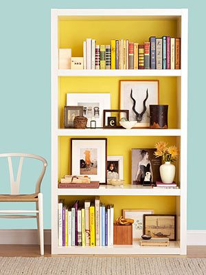
The second round of inspiration came from the one, which I believe is made of Ikea Billy shelves with the backs painted.

creative pantry skills on a budget!, When we bought our house I was so excited to have a walk in pantry!  After placing food in there I hated the wire shelving it came with.  After much research on custom cabinetry I saw my dreams of having a nice pantry dwindle.  In the wonderful land that is the internet I came across a site called Ikea hackers.  This site changed everything!  I could actually have my dream pantry!  All it would take is some measuring and some "hacking" of Ikeas billy shelving.  This is the result of standard billy shelving, paint, and some trim work.  , A place for everything and everything in its place.  I can now display my home canned goods, pasta, spices, oils, etc., Kitchens Design
Please pin from the source: HGTV Roomzaar
Please pin from the source: HGTV Roomzaar
creative pantry skills on a budget!, When we bought our house I was so excited to have a walk in pantry!  After placing food in there I hated the wire shelving it came with.  After much research on custom cabinetry I saw my dreams of having a nice pantry dwindle.  In the wonderful land that is the internet I came across a site called Ikea hackers.  This site changed everything!  I could actually have my dream pantry!  All it would take is some measuring and some "hacking" of Ikeas billy shelving.  This is the result of standard billy shelving, paint, and some trim work.  , Kitchens Design
Please pin from the source: HGTV Roomzaar
What caught my eye about this idea is that I have three unstained solid wood bookcases that we no longer use. They are 12" deep with is PERFECT for all my green staple containers. I think the paint is really fun, although as much as I love purple, I think it will be too dark for my enclosed pantry, so maybe I would reverse the colors, or go lighter, like this:

Family Circle
This photo was originally in Family Circle magazine, but the link is dead, so I sourced this photo from Tart House.

All of this leads us to where we are today, with my beautiful 9'x9'10" pantry all framed in and waiting for innards:
a little perspective. lots of room to store goodies for the neighborhood kids!
We know that we will be upgrading to a standing freezer (anyone want to buy our chest freezer?), which will make it easier to store extra staples as well as the portion of cow we're planning to buy from a local farm.

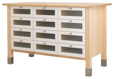
The bookshelves will fill up one wall, and the freezer will be placed on part of a second wall. A third wall will be the appliance shelf. Our original plan was to have our carpenter make the counter for us with some laminate. I love the idea of butcher block, and we considered it for the pantry and kitchen island(s), but the cost made us cut it out of the budget. But then, I found this little beauty at Ikea:
Updated 08.16.13: Sadly, the Ikea Varde Counter Storage Unit has been discontinued.
I love the butcher block. I LOVE all the drawers. I love the natural wood that goes with my natural book shelves. I love the steel accents. I really love it.

There are several pieces in the Varde kitchen collection, so we can play around with sizes to figure out what fits. You can also buy just the butcher block, in a variety of sizes.
Pretty birch butcher block.
Ikea Varde Base Cabinet.
VĂ„RDE Shelving unit IKEA Stands steady on uneven floors because it has adjustable feet. Gives you extra storage, utility and work space.
Ikea Varde Shelving Unit.

Ikea Varde Drawer Unit
Ikea Varde Wall Shelf with 5 Hooks
I also found a few items that were not part of the Varde collection, but could easily work well:
Ikea Groland Kitchen Island. (!)


Ikea Norden Occasional Table.
Ikea Stenstorp Kitchen Cart. Not sure if I'd keep it white or paint it. Depends on what I did with the shelves.
We'll be meeting with the carpenter in a few weeks to talk about the final design,  but I've very happy to know that we have a lot of components to play around with to get started. The beauty of Ikea is that all these pieces are not assembled when you bring them home, so if it's easy/more cost-effective for the carpenter to use these items to make a unit that works and fits in my pantry, then we'll be done that much sooner.

A fun splurge idea I found at Ikea was this pendant for only $29. I'm not sure if it'll provide enough light, but it sure is pretty!
Ikea Fillsta
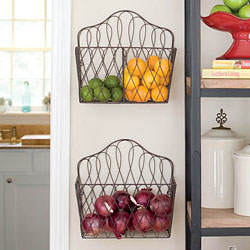
I've been having a lot of fun on Pinterest.com looking for ideas. Two keepers are this DIY can rack made with upside down wire closet racks.
Kitchen Storage Solutions: Pantry Storage Tips & Cabinet Organization Tips
Please pin from the source: The Family Handyman

French Wire Convertible Basket - Willow House Spring Catalog
French wire convertible baskets as sold by Willow House. Updated: the baskets are no longer available. Source photo from The Homestead Revival.
Lastly, a door. I like the look of a frosted door, like one of these two options, depending on whether or not we go for a full door or double door (the doorway is 36" for universal design).

Please pin from source: Shelly K on GardenWeb
Image found at Shelterness
Whichever way I go, I'd love to put something like this on the door:
love this!
Available from Wall Quotes
***updated February 28, 2012***
We are now moved in! My new pantry isn't totally done yet, but here's a first peek at how it looks one week post-move in.

***updated November 19, 2012***
Our new pantry is organized. Wanna see?